A life-critical interface redesigned from the ground up, built around how nurses actually work, not how the machine was engineered. Fewer touches, faster decisions, safer care.
My role
Senior UX & Service Designer
My responsibilities
Research, Workshop preparation & facilitation, Validation, Information Architecture, Interaction design
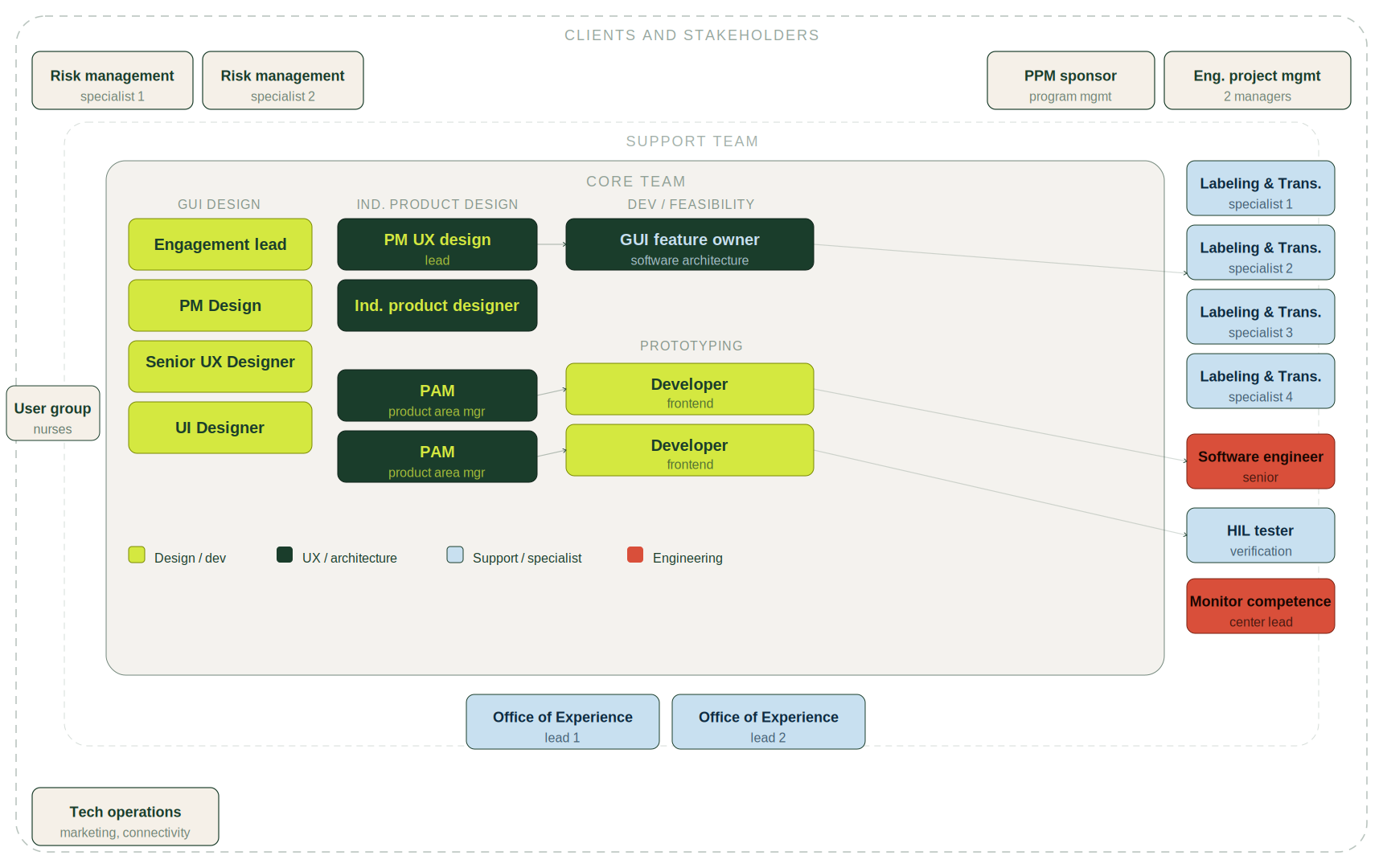
Team
Project Manager
UI Designer
2x Developers
2x Product application experts
Duration
8 months
Sector
Healthcare / Medtech
THE CHALLENGE
The existing interface had been built around machine logic, not nurse workflow, in a context where errors directly affect patient safety. Every unnecessary screen touch is a contamination risk. New nurses needed to operate confidently with minimal training. And the solution had to scale across a full ecosystem of devices, not just one machine.
the process
DISCOVER & DEFINE
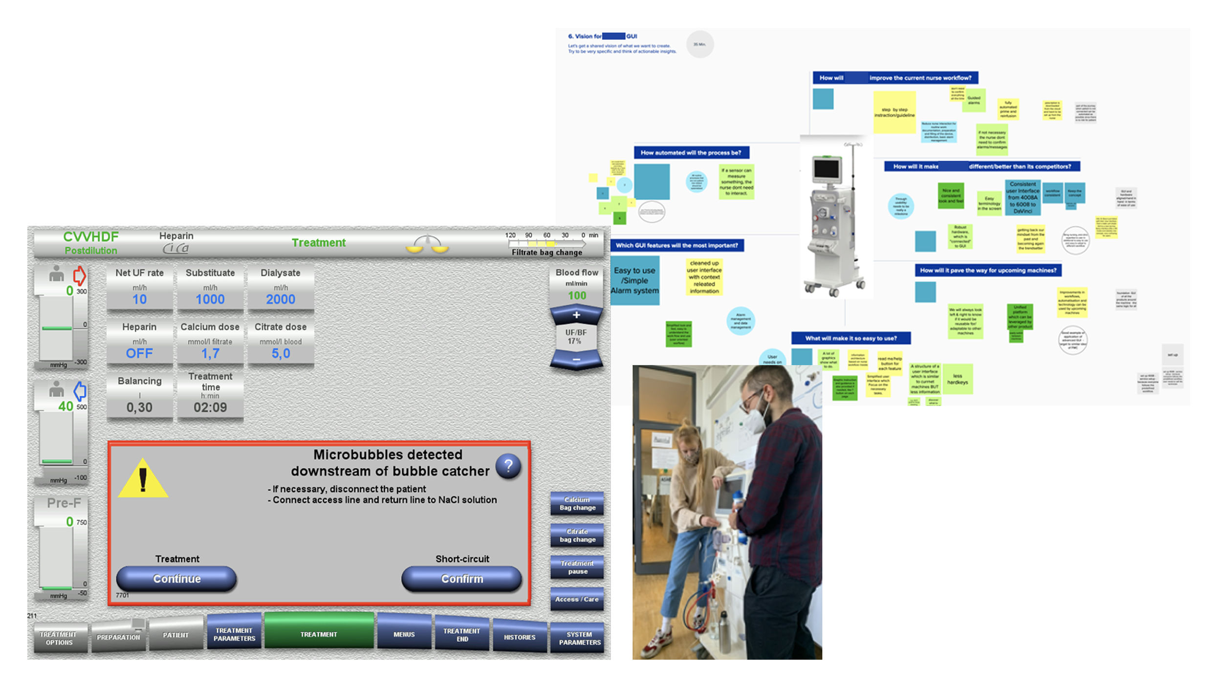
We kicked off with interviews across a cross-functional group, former nurses, clinicians, and PMs, to map the current experience from multiple angles. I immersed myself in the domain independently: hands-on machine onboardingwith clinical experts, and working through the machine manuals to understand the full feature set and clinical constraints.
I facilitated stakeholder workshops and created the as-is workflow blueprint, which is where the real problem surfaced. Context switching wasn't just a digital issue; nurses were moving between multiple screens, physical steps like attaching solutions to the machine, and paper-based patient records to cross-check details. No single view held the full picture. We realigned the entire design direction around reducing that fragmentation and bringing the essentials into one unified interface.
Research and machine onboarding
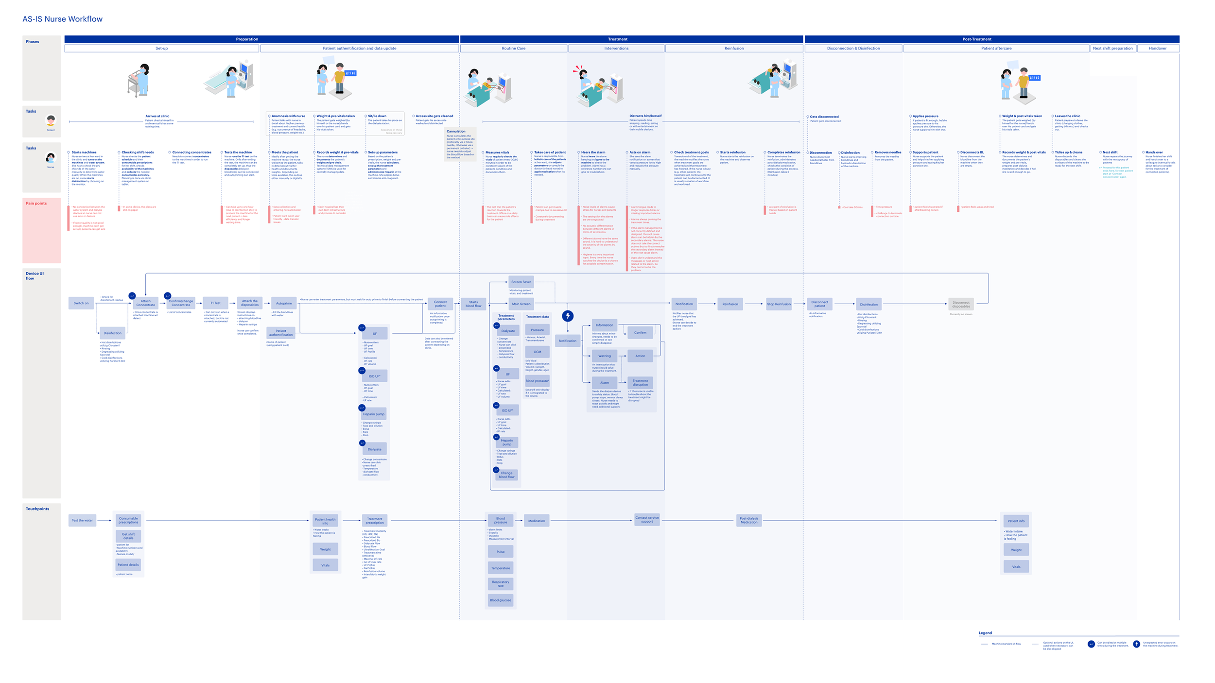
As-is nurse workflow
Stakeholder map
IDEATE & VALIDATE
A two-day co-creation workshop brought 18 stakeholders into the virtual room, former nurses, clinicians, and PMs working in small groups, using the as-is blueprint as a starting point. I translated the ideas that emerged into low-fi prototypes, refined across two rounds of user tests with nurses and clinical experts.
Expert resistance became the most useful data point. Some pushed back on the simplified workflow, arguing nurses would need more controls for safety. Testing showed the opposite; nurses understood the guided workflow quickly and confidently.
Nurses defined what stayed. I refined the progress bar and treatment screen around what they flagged as essential and most-used, cutting everything else. Responsive layout was a requirement from day one, so I designed for it from the first iteration rather than retrofitting it later.
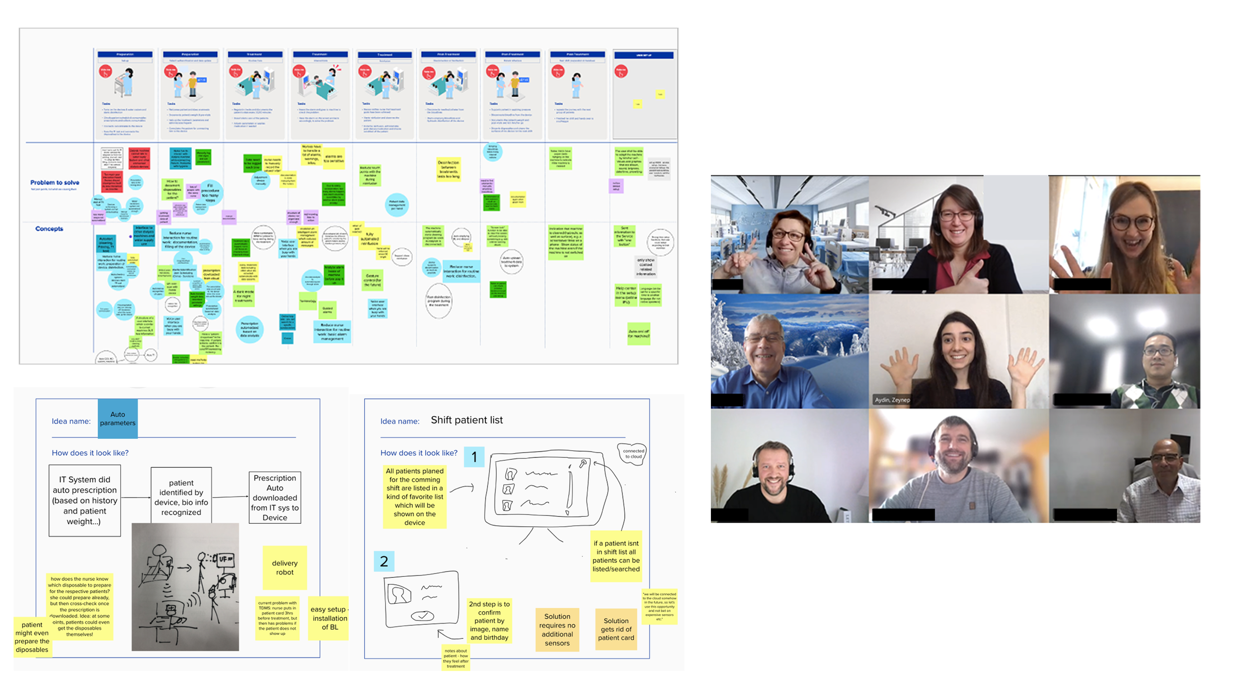
Co-creation workshop with 18 stakeholders
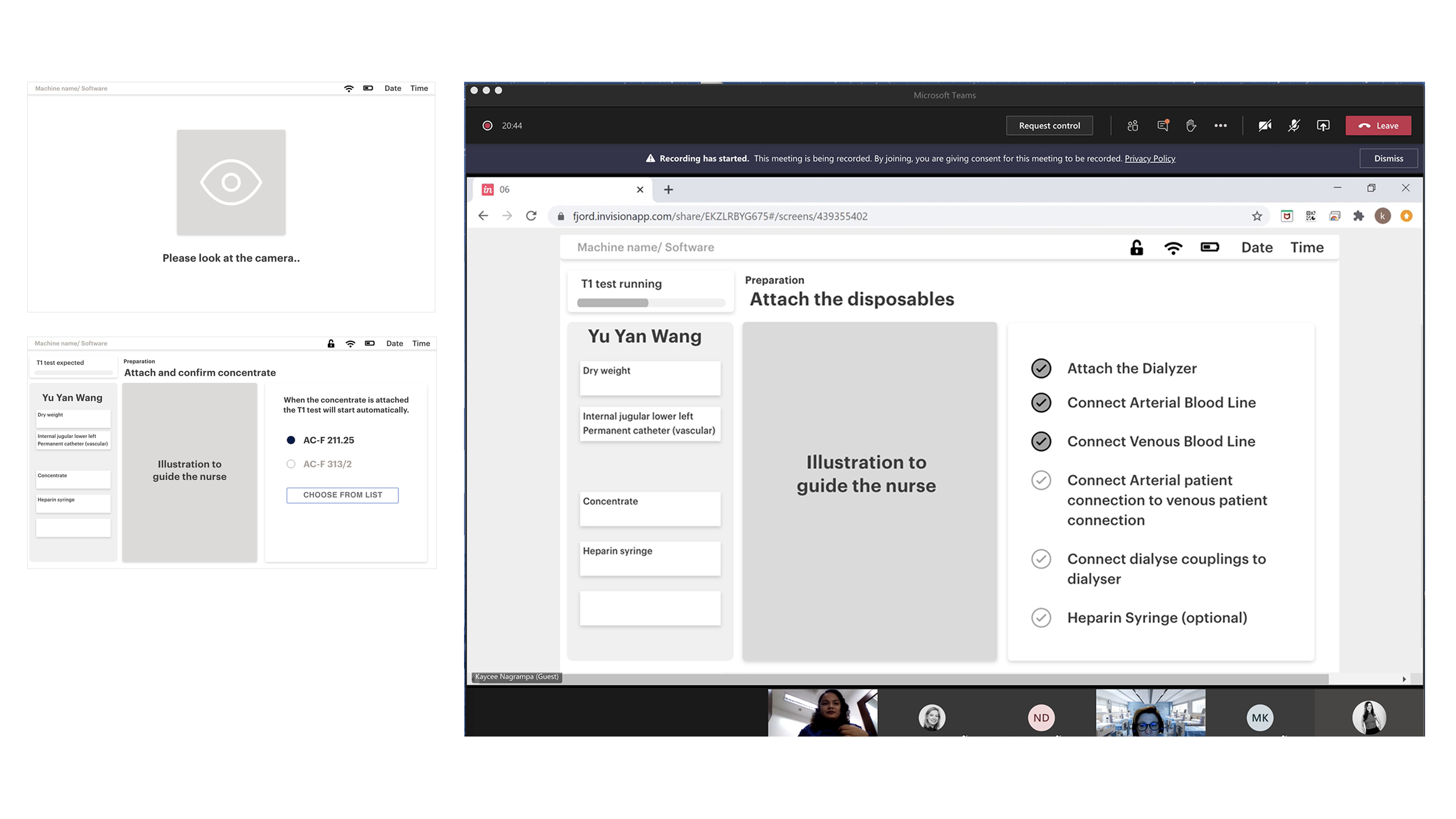
Low-fidelity protoype testing with 8 nurses from different regions
DESIGN & DELIVERY
We built a scalable component framework as the foundation, designed to work across the device ecosystem from the start. From there I mapped the full interaction flow, covering every state a nurse would encounter during a treatment session.
We validated the hi-fi prototype with 14 nurses across different regions, focused on real task completion. The results were clear: screen touches reduced by 45% compared to the legacy interface, and nurses were onboarded and operating confidently from the first session. We handed off the full hi-fi design files to the development team to move into build.
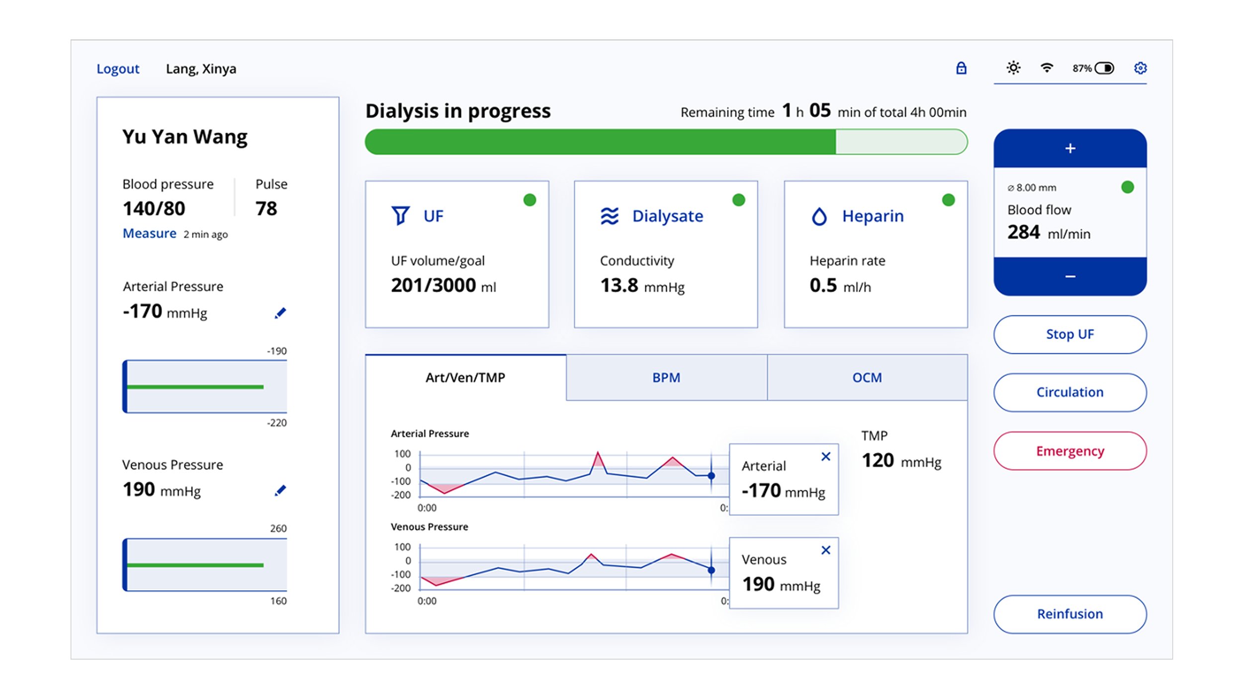
Treatment screen
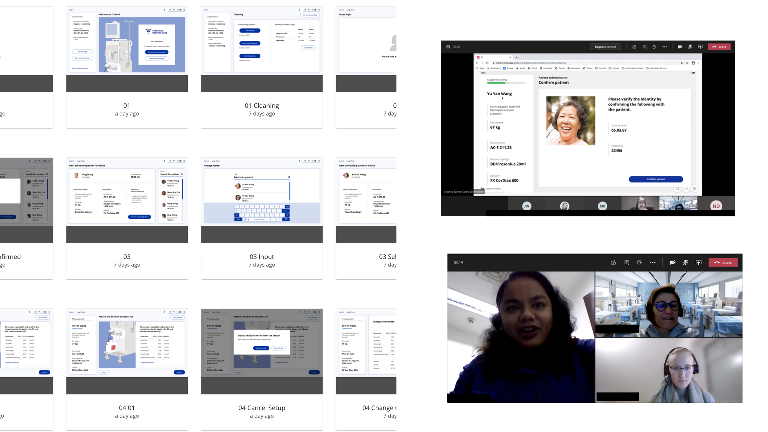
Final product user tests with 14 nurses from China, the Philippines, Portugal, the US, and Latin America
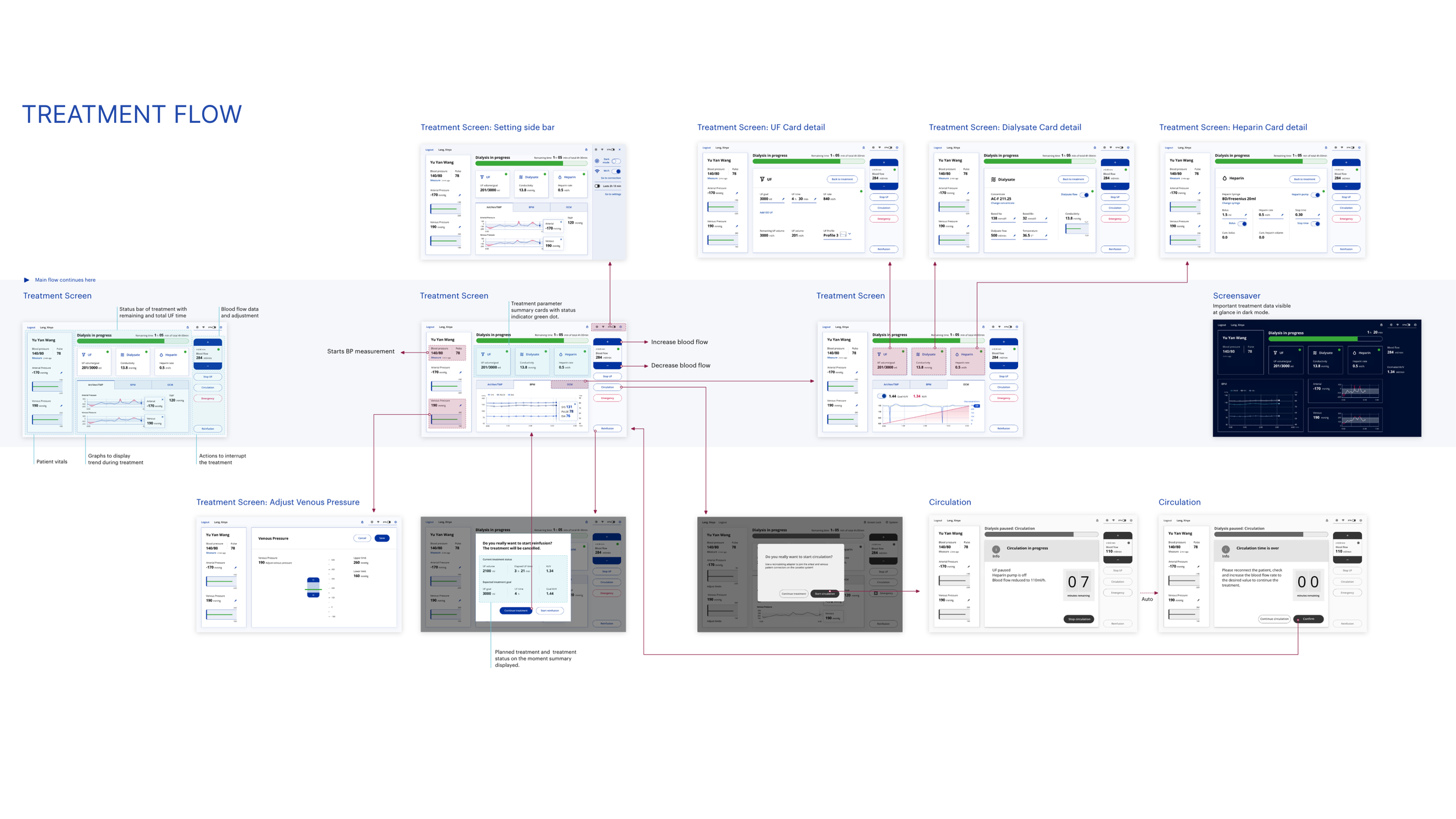
Treatment flow
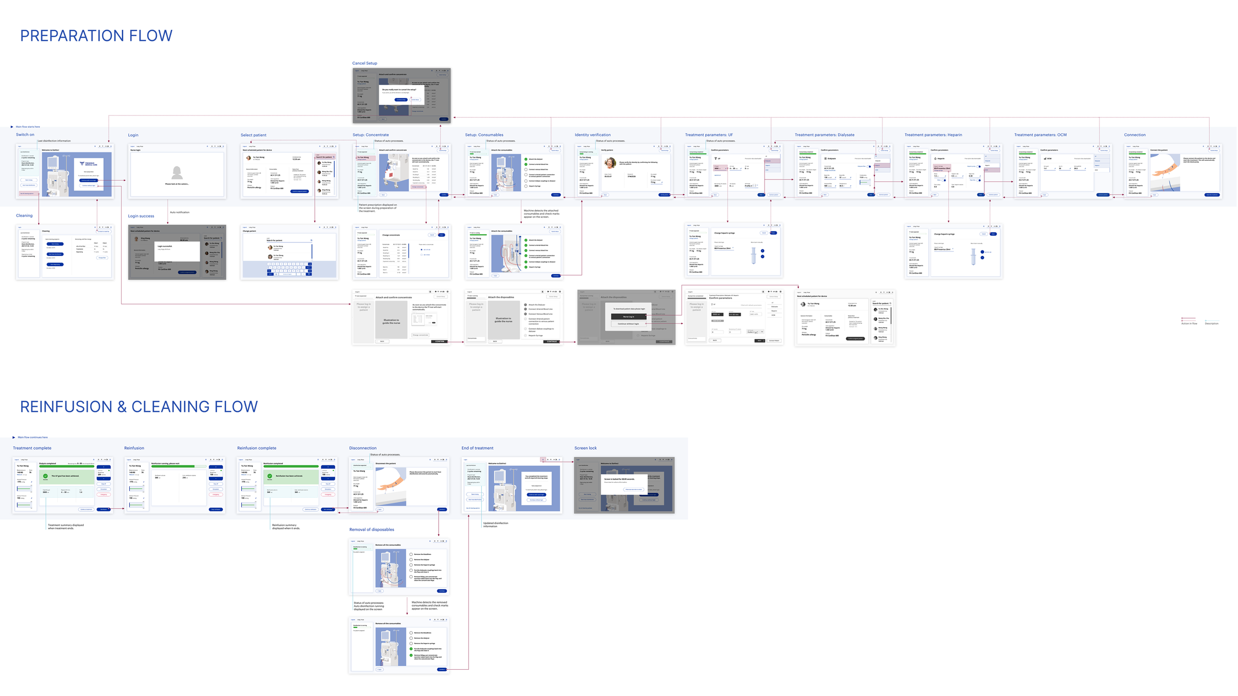
Machine preparation and reinfusion flow
REFLECTIONS
If I did this again, I'd push harder for in-person clinic access. Shadowing nurses in a real treatment environment would have surfaced nuances that interviews and workshops couldn't. I'd also involve nurses more directly in the co-creation workshops, not just in testing. Their instincts consistently proved sharper than the experts' assumptions.